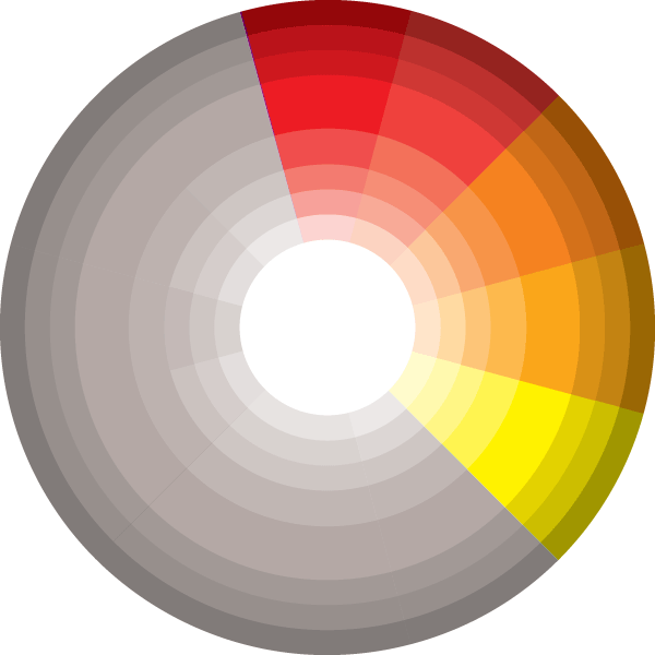
In this tutorial, we’ll look at what color palettes are, tools for choosing colors that go together, and the secret to picking a perfect color scheme for our games!
An Introduction to Color Palettes
The term color palette is used widely across many different industries of design. Its exact definition and interpretation varies slightly between industries, but for the purposes of game design we can simply refer to it as a predefined set of colors based on specific rules.
Traditional color palettes generally consist of five colors within a specific scheme, but this is more of a guideline than a rule. In game design, color palettes can consist of any number of colors as long as they all follow your predefined set of rules.
Before we delve deeper, consider whether you want to create your own color palette or find a ready-made scheme online. Either way, there are many tools that can help you out!
Picking Palettes With Tools
Color palettes can be created in virtually every program with a color picker, but why use MS Paint when there are so many great websites that can get the job done better?
Kuler
Adobe Kuler is one of my favorite tools for making a color palette, simply because it acts as an all-in-one tool.
As well as being able to create your own color palette and pick colors from an image you find inspirational, you can also share your palettes and find ones created by others! This means there’s a never-ending supply of ready-made palettes for you to choose from.
I recommend using this tool if you are looking for an in-depth experience or if you are looking to find user palettes created by others.
Color Scheme Designer 3
Another great tool for making color palettes is Color Scheme Designer 3. It has all the standard features you would expect from a color palette tool, and really shines in in its interface design!
I found it effortlessly easy to jump in and make a color palette. I would recommend using this tool if you are looking for a simple experience.
Color Blender
The last tool I am going to suggest is Color Blender. Out of the three tools I would have to deem this tool the most interesting.
Instead of supplying you with a color wheel and a whack of values to modify it simply gives you three sliders (RGB/HSB) to play around with. Like Kulur, it has a section where you are able to browse palettes created by others.
I would recommend using this tool if you are looking for a tool that actually assists you in creating color palettes.
Common Types of Color Schemes
There are many different types of color schemes you can choose to use when making a game, so I will just cover the schemes you are most likely to pick. They’re all based on the relationships of different colors to each other within the color wheel:

Analogous color palettes consist of colors that are adjacent to each other on the color wheel.

An example of an analogous color palette would be a color palette that goes from red to green:

or a color palette that goes from blue to purple:

As you can see the colors within each of these palettes are adjacent to each other on the color wheel.
Complementary color palettes are made up of colors that are opposite to each other on the color wheel.

As you can see in this example the center color acts as a base and the colors on the left are complementary to the right:

Monochromatic color palettes are different shades or tints of a single color.

For example take this monochromatic green color palette:

And this monochromatic blue color palette:

The colors in each color palette remain the same while the brightness is decreased.
Custom color palettes are by far my top choice for game artwork. They can consist of any color, but are restricted to specific shades or tints: that is, they occupy the same ring on the color wheel.
At first glance the color palette below seems to consist of completely random colors:

Indeed, the colors have no particular link to each other, but note that the brightness and saturation of each are the same – they’re all from the middle ring of the color wheel.
Color Schemes Based on Themes
It’s obvious that not all color schemes are going to look visually appealing with every single game’s theme. A color scheme should be used to strengthen the mood you are trying to convey.
Picture a horror movie: the scariest scenes all take place in a dark environment or at night. That’s because dark colors convey a feeling of unease. So if you were to make a horror game, you probably wouldn’t pick hot pink as the dominant color of your game; you would most likely choose a monochromatic or custom color palette consisting of dark colors.
LIMBO is a game that makes incredible use of an all-grey palette. Take a look at how this gives the game an eerie feeling:
Before jumping right in to making your color palette, take a look at some form of media based around the theme of your game. You will often be able to detect some color schemes that work nicely and some that don’t, giving you the luxury to pick and choose the colors that appeal to your specific needs.
The Secret to Creating Perfect Color Palettes
What if I told you there was a way to create perfectly matching colors every single time you made a color palette, would you believe me? Well hopefully you did because I don’t want this next bit to seem like witchcraft to you.
All colors on a computer can be defined by three numbers: hue, saturation and brightness. This is important, as it lets us see patterns and relationships between sets of colors. Let’s wrap our heads around what each value means.
Hue defines the tone of the actual color. For example, the color red has a hue value of 0 regardless of what you set the saturation and brightness values to. If you change that hue value to 120 you will have changed the color to green and if you change it to 240 the color will become blue.
Now what happens if we take one of those colors and give it a saturation value of 50? It looks as if you are picking a different color, but you are actually only affecting the intensity of the color – that is, how vivid the color is. Reducing the saturation makes the color look washed out.
Brightness, then, accounts for how light or dark the color is. If we reduced the brightness of a color, we would see this as a darker shade of that same color.
To create a great color palette you need only follow this rule:
IF hues do not equal each other
THEN set saturations to match each other
AND set brightnesses to match each other
ELSE IF saturations do not equal each other
THEN set hues to match each other
AND set brightnesses to match each other
ELSE IF brightnesses do not equal each other
THEN set hues to equal each other
AND set saturations to equal each other
But Games Have Many Shades!
If you strictly follow the rule above you will create an amazing color palette, but if you try to use the palette you will most likely end up with a flat looking game.
That’s because you only have a single shade for each color – but don’t fret, we can easily add more rows to our palette! All you have to do change either the saturation or brightness by a specific interval.
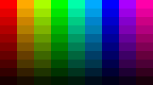
In this massive color palette the colors increase in hue value by 40 each column, and decrease in brightness value by 10 each row:

Conclusion
Thank you for taking the time to read this article on color palettes. If you’d like to learn more about the relationships between colors try comparing the HSB (Hue-Saturation-Brightness) values throughout the various color schemes, or look up some other color schemes (triadic, tetrads, warm/cool). Please feel free to leave a comment or question!


