The mobile market has begun to target the younger generations in a big way. Entire sections of app markets are dedicated towards applications and games aimed at the pre-school demographic. Developers have taken note, and the market has become increasingly crowded.
When you create an app targeted at the youngest generation, you need to be aware of two key things:
- The attention span of your audience
- The complexity of your GUI (Graphical User Interface)
In this article, I'll talk about the typical user interfaces associated with most touch-screen based applications, and how to best modify them when approaching this market.
First Impressions
One theme you'll notice within this article is that of reducing barriers to entry. The more screens that are placed between a young mind and your intended content, the more likely the child is going grow impatient and give up on your app.
Let's start with what most apps begin their experience with: a splash screen. The quick takeaway? Don't use one. No two-year-old I have ever met cares that JohnSmithDevelopment built his song-and-dance app; she or he just wants to get to the music. Then comes the dreaded click of the home button, and your elusive target audience is off to check out something else.
Children have a short attention span. You want to get to the goods of your app as quickly as possible. Begin the background music at start-up, and don't leave any stagnant screens. Boredom is your enemy.
The Start Screen
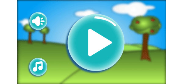
Often, the next presented element present is a "start screen". This screen usually has the title of your app and a button marked Play or Start or with an equivalent symbol—something similar to this:
This screen is usually running an animation, bouncing the title around or something similar. This particular example of a start screen has one glaring error, but to understand it, we need to look closer at how a child interprets your screen.
A Menu-Driven Digression
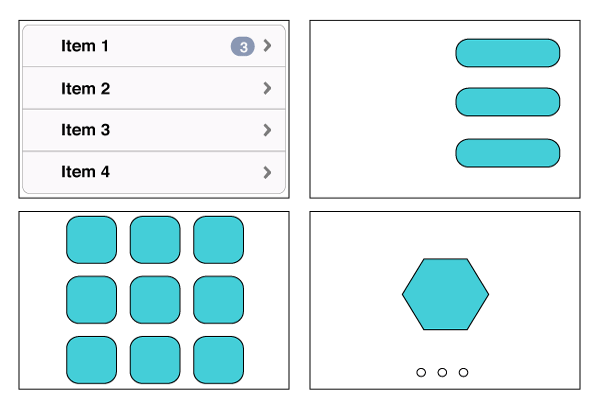
The way you or I view content on our handheld device (or anything electronic, for that matter) is vastly different from the way a child views it. Take, for example, these familiar mock-ups:

As an experienced user, you would look at the description on the button or table element, and find your way to your desired content. This is not always the case for a child. You may see a button with the word Play on it, and instinctively know what to do, but can a one-year-old read the same button and understand the same way? Probably not. The typical menu structures simply don't work well when aimed at the really young. So what to do?
Size Matters
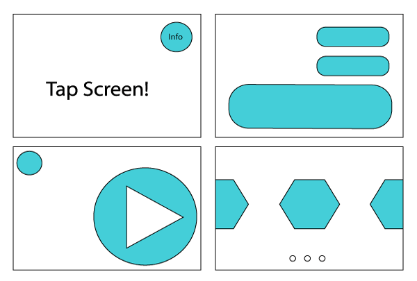
Lets look at some menu structures that are better targeted to toddlers:

What we have changed in these examples is that the user is now visually directed towards the path we desire. We remove the need for the child to understand what each button does, and instead pull their attention to objects based on size or location.
Typically, everything else being equal, you can expect the child to be drawn to the largest object on the screen. Conversely, if you have a lot going on in your screen, removing the menu or buttons all together is a good approach, simply needing any touch on the screen to move along to your content. There are pros and cons to each GUI you decide to employ.
No matter how you approach it, whenever you render a scene to the screen that is not your content, you have created a barrier between the child and your game.
Button Content
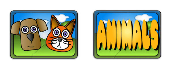
Let's take a look at two buttons:

Here is another example of relaying information visually to your user. While these two buttons mean the same thing, the button on the left better conveys to a child what they can expect.
Pictures mean more to a young child than words do. Text is an enemy of the toddler menu, so use it sparingly. This holds true for options buttons and navigation buttons also. "Back" means less than an arrow graphic. Same goes for "Replay", "Menu", and so on.
Design your navigational items like you would for a global market: minimize text and use graphical cues.
Colours and Sound
Your menus need to pop off the screen. There are some awesome colour based tutorials on this site to help get you started picking a color palette for your game or app.
In respect to the menu, keep your buttons or interactive objects bright and vibrant, and your background objects more muted. A shadowing effect on the foreground objects also helps to give them the impression of "popping" off the screen, and therefore more likely to draw attention.
See how much more the buttons pop when the background graphics are blurred?

Likewise, sound is a huge attraction for children. Light, peppy music will hold some attention. Save the dark brooding music and the heavy metal riffs for your RPGs.
Also, when you are selecting background music for your app, be careful to find a tune that parents will be able to tolerate. They are the ones who will have the final say as to whether your app has any staying power on the device.
Spice it Up
We have some powerful tools in our arsenal, but we can do better. So far, our menu is still fairly static and dull. Children are using this device for a visual stimulus, and giving your menu some spice will help to maintain their interest.
This is accomplished with a few tricks, namely animations, actions and particle effects. You could have the main character smiling and waving in the corner, or a train trundling across the bottom of the screen, or any number of timed random events occurring all at once either beside or behind your menu.
I would caution against too much of this "noise", though. Anything that doesn't actually benefit your menu (that is, anything that's just there for show), will distract your user from your actual GUI. Instead of adding this noise, why not run some simple actions on your existing menu to draw the user's attention and give some zip to your scene in the process? For instance, having a button visually move, or grow and then shrink in a sequence, is a great way to draw attention to it.
Here is a simple comparison of a static button to a pulsing one:

The eye is instinctively drawn to the moving button. I like to use actions to create this effect in my programs. The code for such an action is shown here (the code is written in Objective-C, but is easily adaptable to other languages):
        //Create the non-moving button as a sprite
        SKSpriteNode *button1 = [SKSpriteNode spriteNodeWithImageNamed:@"PlayButton.png"];
        button1.position = CGPointMake(self.size.width/4, self.size.height/2);
        [self addChild:button1];
        //Create the moving button as a sprite
        SKSpriteNode *button2 = [SKSpriteNode spriteNodeWithImageNamed:@"PlayButton.png"];
        button2.position = CGPointMake(self.size.width*.75, self.size.height/2);
        [self addChild:button2];

        //Create the base actions for scaling up and down the image
        SKAction *pulseOut = [SKAction scaleTo:1.2 duration:0.5];
        SKAction *pulseIn = [SKAction scaleTo:1.0 duration:0.5];
        //Create a sequence of the scaling actions, and repeat them forever in a loop
        SKAction *sequence = [SKAction sequence:@[pulseOut, pulseIn]];
        SKAction *repeatSequence = [SKAction repeatActionForever:sequence];
        //Run that action sequence on the button in question
        [button2 runAction:repeatSequence];
The great thing about actions is that they require no additional graphical resources. There is no effect on your app-bundle size, and you don't need to hire an artist to draw a sequence of images for you. Having said that, you can achieve similar effects with traditional animation sequences and atlas files.
Particle Effects
Having your button move is great, but what if we could make it pop off the screen even more? This is where particle effects can work to your advantage. A particle is simply an image that we can use over and over thousands of times to create an effect.
We can create another great looking effect to draw some attention to our buttons with the addition of a single small image, a description XML file, and three lines of code. The intricacies behind particle effects and actions are a bit beyond the scope of this tutorial, but for the sake of completion, here is the code to load the file:
  //Create a particle effect emitter with a file
  SKEmitterNode *emitter = [NSKeyedUnarchiver unarchiveObjectWithFile:[[NSBundle mainBundle]
                                                                      pathForResource:@"backHighlight"
                                                                      ofType:@"sks"]];
  //Postion the Particle effect node at the button, but behind it
  emitter.position = CGPointMake(button2.position.x, button2.position.y);
  emitter.zPosition = -100;
  //add the emitter to the game scene
  [self addChild:emitter];
And here is the result:

The image gains more depth from this effect, and gets even more attention drawn to it.
There and Back Again
So, what was wrong with that menu from earlier?
When I gave it to my young son to test, he kept trying to tap the animated title. The Play button was stagnant, and, although it was big and prominent on the screen, he kept being drawn to the bouncing animated title. He got frustrated, and before I could shown him how to get to the next screen, he pressed the dreaded Home button, looking for something else.
I had followed two of my tips from above, but had one crucial misstep: distraction. I had inadvertently created a barrier within my start screen.
Remember, when dealing with toddlers, you can't expect then to have the patience to sort out how to make your app work. If it doesn't make sense to them after two tries, they will move on. Remove barriers, and make it simple and intuitive so that someone with no written language skills or product experience will know what to do.
Guidelines and Tips
With that in mind, here are some guidelines to take away:
- Every screen you place between the child and your content is one more chance they have to dismiss your app altogether.
- Make your buttons prominent, both in size and in colour, texture, and contrast.
- Make your buttons the focal point of the screen; any animation should be performed on them and not on other elements which may serve as distractions.
- Keep the music flowing, but give the parents a simple way to turn it off.
- Avoid unnecessary text; your user is unlikely to be able to read it. Use icons and common images for "play", "sound", "menu", and so on.
- Do not assume your user is dull—they may very well know how to use the machine better than their parents. However, also don't assume that just because you show them a table view or a paging element that they know how to find more content. Always give a visual indication of where to look for items on the screen.
The best advice I can offer you is this: the best menu for an application or game aimed at toddlers is no menu at all.
If your user has to click more than one button to get at your content, you have too many. The only real reason to have a button in your app is if you are presenting your users with more than one activity to choose from. In this case, make each activity have a similar sized and highlighted button, and make all elements equivalent in prominence.
If your content must fit on more than one screen, always leave a visual indication to the user that there is more content available. In these cases, I use a "peeking" feature to show part of the next button, as in this video:
Conclusion
Thanks for reading, and I hope that you have found this discussion insightful. If you have any comments, please feel free to leave them below. I'd also love to see any menus you make for your own apps.
I have included a sample project file with this tutorial, written in Objective-C with xCode 5 for the iOS platform. This project shows an example comparison of two buttons, one static and the other including action-based pseudo-animations and particle effects.
Attribution
- Font: Pleasantly Plump by James Fordyce
- Graphics, images, and videos by Richard Yeates
