Everything old is new again, and retro games are more popular than ever. Bolstered by nostalgia and the abundance of casual and arcade-style games on iOS and Android devices, old school games are making a comeback. In this tutorial I’ll give you some tips on creating a successful retro-themed game.
Choosing a Retro Style
What do we mean when we talk about ‘retro’ games? There’s no concrete definition, but I typically think of games made before 1990. This includes games from consoles like the GameBoy, NES, Atari 2600, and Commodore 64, as well as classic arcade games like Pac Man, Centipede, and Space Invaders.
All of those examples use blocky, pixelated, bitmap (or ‘raster’) graphics. These are the type of games that probably come to mind for most people when they think of retro games.
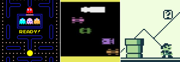
Raster Graphics: Pac Man (Arcade), Frogger (Atari 2600), Super Mario Bros. (GameBoy)
But the earliest video games actually used vector graphics. Games like Battlezone, Asteroids and Tempest were rendered with brightly glowing lines instead of blocky pixels.
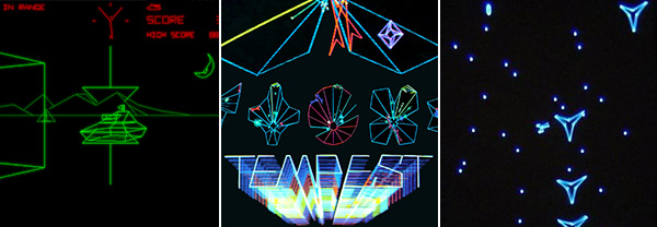
Vector Graphics: Battlezone (Arcade), Tempest (Arcade), MineStorm (Vectrex)
Another type of game us old folks used to play were simple handheld games that used a monochrome LCD display and extremely simple game mechanics.
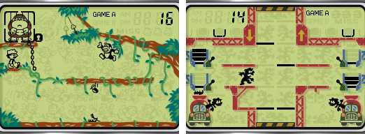
LCD Graphics: Donkey Kong Jr. (Game & Watch), Mario’s Cement Factory (Game & Watch)
In this tutorial, we’re going to talk about the more popular raster graphics games, but I mention these other types of games because they are not often emulated, and I think there is a lot of opportunity for game designers to do something really cool with those styles.
Creating a Color Palette
To create a convincing retro look, you’ll want to work with a limited set of colors.
Old-school game consoles were only able to display a limited number of colors. Depending on the system, graphics would be shown in black and white, grayscale, or 8- or 16-bit color. You can see examples of the exact color palettes from specific systems on Wikipedia, but it’s not important to choose historically accurate colors as long as you maintain a consistent style within your game.
We don’t face the same hardware limitations we did in the past, but keeping your palette limited to a few carefully chosen colors will not only emphasize the retro aesthetic, it will also help to define the identity of your game. Look at these two examples of color palettes from Super Mario Bros.:
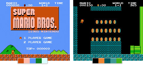
The colors are so distinct, you can almost recognize the game just from the color swatches.
David Sommers has a nice collection of classic game palettes at ColourLovers.com.
The exact colors you choose will depend on the theme and mood of your game, but if you take the time to choose a good set of colors your game will feel as iconic as the classics. Take a look at these modern examples:
If you’re having trouble choosing colors that work well together, check out this great tutorial by Tyler Seitz, Picking a Color Palette for Your Game’s Artwork.
Choosing a Pixel Size
Retro raster games are most easily recognized by their big chunky pixels, from a time when screen resolutions were much lower. In today’s world of HD screens and Retina displays, the physical pixels on our devices are barely visible – not nearly prominent enough to get the retro blocky look.
In this example each pixel from our character graphic is being displayed on screen with four physical pixels.
To account for this, we need to use multiple physical pixels to display each visible pixel in our game graphics.

You can decide what level of scaling is appropriate for your game depending on how blocky you want your game to look. Usually scaling up to two or three times normal size gives a good effect. Keep in mind that the bigger you go, the less you’ll be able to fit on the screen.
I recommend that you always let your game engine do your pixel scaling for you. This means that all your assets and text are drawn at 100% (small) and the game simply scales up the entire game canvas to get to the final size. You could actually draw assets with larger pixels, but this will increase file sizes and load times, and can also have a negative impact on game performance.
Inconsistent pixel sizes don’t look quite right.
Trying to scale your assets manually can also lead to inconsistencies in your pixel scale. In the example above, notice how the pixels in the game title are huge compared to the tiny pixels in the ‘Play Now’ button text. Also, our game character is blockier than his gem or the cave floor. Some of these are subtle differences but they all add up to make the game look a little bit ‘off’.
Neven Mrgan (co-creator of The Incident) talks a little more about this on his blog.
Drawing Pixel Art
Creating great-looking pixel art can be extremely challenging. It takes lots of practice, and is a topic too lengthy to fully cover in this tutorial. Here are a few links to get you started though:
Drawing & Animation Tools
Many people use regular graphics programs like Photoshop, Gimp, or even MS Paint to draw pixel art.
I found it frustrating to use Photoshop once I started trying to animate characters and lay out seamless tiles. So I created a tool called Pickle to help fill in some of the functionality that was missing from traditional editors, like live animation previews, seamless tile previews, and terrain tile previews.
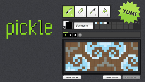
Pickle has a limited feature set and doesn’t meet everyone’s needs. Luckily there are other similar apps like Pyxel Edit, ASEPRITE and GraphicsGale.
Tutorials
There are a lot of good pixel art tutorials online. Here are a few that I’ve found helpful in the past:
- The Pixel Art Tutorial from the Pixel Joint Forum
- Derek Yu’s Pixel Tutorial
- Photon Storm’s 16×16 Pixel Art Tutorial
Character Design
Designing convincing characters with lo-res graphics can be really difficult. How can you depict enough detail to create a unique character with so few pixels and colors to work with?
As with drawing pixel art in general, character design is something that takes patience and practice. We can learn a few helpful strategies from classic game characters.
Use Limitations to Your Advantage
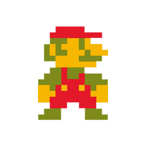
Take a look at our friend Mario here. Notice how few pixels are used to depict a recognizable human character. Three colors, no outlines, no shading. How can you draw a face with these limitations? Look at how the pixels that draw Mario’s mustache also serve to define his nose and mouth as well.
It would also be difficult to draw Mario’s arms at this level of detail without having them merge into his body, making his body look like a little blob. Mario’s creators solved this problem by dressing him overalls. See how the lines of his clothing clearly separate his arms from the rest of his body? Genius!
In this case, adding specific physical attributes to the character (facial hair and overalls) actually make it easier to draw him within the graphical limitations. The limitations themselves inform the design of the character.
Go Abstract

Another technique for dealing with graphical limitations is to go abstract. Why bother trying to draw a recognizable human character, if you don’t have to? Look at Pac-Man there. He’s not a recognizable anything. He’s just a yellow blob with a mouth.
Pac-Man is a memorable character despite his lack of physical attributes. He gets his personality from the gameplay – the way he moves through the maze, his sound effects and the way he interacts with his enemies.
Who says you need to have human characters in your game? Why not make the next Pac-Man, Q*bert, or Qix?
Menu and Score Text
When creating graphics for your title screen, in-game menus and other text elements like scores you need to stay consistent with the style of your graphic assets. This means keeping the same color palette, pixel size and art style.
Most fonts are designed to be anti-aliased (smoothed) when displayed on screen. This means if we try to blow them up to match our pixel size, we’ll see a lot of noisy pixels around the edges of the letters. It also just doesn’t match the aesthetic we’re going for. It’s all soft and blurry instead of crisp and blocky.

Gotham Bold without anti-aliasing
So we want to display the fonts without anti-aliasing. But simply displaying a normal font without smoothing will usually look terrible. They just aren’t designed to work that way. See how funky and hard to read it is at 100%? When we blow it up we can see a lot of stray pixels and uneven strokes.
The answer is to always use fonts that are designed to be displayed without anti-aliasing. They read nice and clean at small sizes, and have that great chunky retro look when we blow them up big.
Some of my favorite pixel fonts are made by Matthew Bardram of Atomic Media.
One caveat to using pixel fonts is that each font is designed to work at only a certain size. Make sure you only use the font at this specific size or a multiple of that size. So if you’re using a font designed to work at 10pt, it will also look fine at 20 or 30pt, but not at sizes in between.
Game Mechanics
Think about what type of game mechanics will work best with your art style. Choosing a simplified, classic mechanic will help your players get into the retro mood. Some classic game mechanics are space shooters (Asteroids, Space Invaders), platformers (Super Mario Bros., Donkey Kong), and adventure games (Adventure, Zelda).
Keep in mind that your limited art style will make it harder for you to convey complex information to the player, so a simple mechanic can be a big benefit.
How simple can you make your game? Can you design a game that uses only one button for the controls?
One-button games work great on touch-based devices, since the player can just mash on the screen without having to worry about hitting non-tactile button areas.
A lot of endless runner style games use the one-button control scheme (Canabalt, Jetpack Joyride, Tiny Wings). Can you come up with a different style of game that works equally as well with just a single button for control?
Distortion Effects
If you’ve ever played one of your favorite old school arcade games in an emulator on your computer, you might have noticed that it doesn’t feel quite the same. Everything is a little too crisp and clean on your computer monitor compared to the blurry, flickering, distorted look of an arcade monitor, or your old CRT television from childhood.
Some people probably think it’s a good thing that we don’t have to put up with these distortion artifacts of a bygone era, but it can be fun to add a little fuzziness back into a retro-inspired game.
Here are some examples of ways you can emulate an old CRT screen:
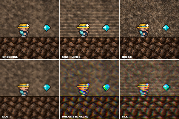
Scan Lines: You can use a static graphic of thin, narrowly spaced, horizontal white lines to simulate CRT scan lines. Just layer them on top of your game. Adjust opacity and blend mode to achieve the style and intensity you want.
Noise: Gaussian noise can add a nice texture to your game. Ideally the noise would be animated, but a static image will work well enough if having constantly animating noise affects your game’s performance.
Blur: A very slight blur adds some nice softness to the image. Don’t go too far with this one; you still want to be able to see the pixels.
Color Fringing: One of my favorite old school effects is to add a little RGB color fringing. You can do this by separating the game canvas into separate channels for red, green and blue and shifting them slightly out of alignment. This effect looks really good when it’s animated, but it can be pretty processor intensive, so you might need to limit its use. I have another tutorial where I show how to implement the effect with AS3: Create a Retro CRT Distortion Effect Using RGB Shifting.
Combination: Combine multiple effects for maximum fun!
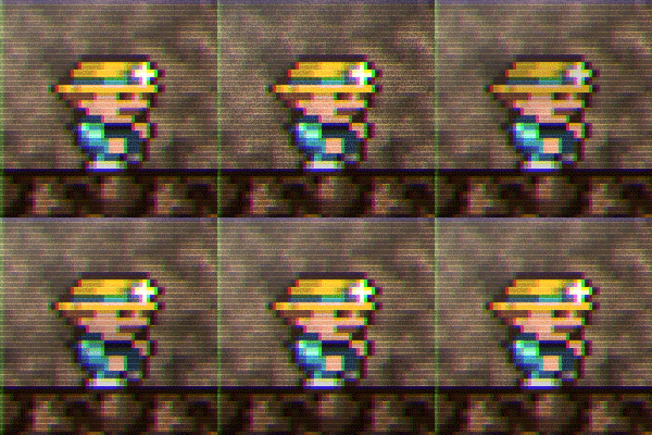
You can also add an animated roll bar to simulate a malfunctioning CRT.
The Flash game Cronus X implements a lot of these effects nicely during menu transitions. This is a good solution if you’re worried about the effects negatively impacting game performance.
Innovate
Don’t get too bogged down by the constraints of old school gaming. It’s more important for the game to be fun have a retro ‘feel’ than to be historically accurate.
And try not to just recreate a classic space-shooter or platformer. Add some innovation to make your game unique. Use the retro aesthetic as a starting point, but add some of your own unique style and elements to create something new. It can even be fun to mix in some modern music, sounds, or elements (like particle effects) to create a fresh take on classic arcade gaming.
Some great examples of this are Geometry Wars which mixes dazzling modern effects into a vector-style arcade game, Space Invaders Extreme where a classic arcade game is layered on top of fancy background graphics and set to modern electronic music, or Fez, a classic 2D pixel art platformer that allows you to transform the world in 3D space.
Happy Game-Making!
That’s all for now. Good luck out there! Drop a link in the comments and show me what you make. I’d love to see your take on the retro aesthetic.

